
eharmony Communication – Redesign
Company
eharmony
Role
Lead UX Designer
Team
UX Designer, UX Researcher, PMs, Tech (web, iOS, Android)
Overview
This was a redesign of a very outdated messaging system within the dating service. The existing communication process was a scientifically proven way to make deeper connections. But, users had a hard time completing the process which were missed opportunities to connect with people.
Challenges
There is always risk to customer perception and adoption when changing a core functionality that people are familiar with. Additionally, communication was an existing source of subscriptions that leaders were hesitant to mess with.
Approach
I set out to use just the right amount of process to find a solution that was successful for users and the business. I also ensured the cross-platform experience was consistent and intuitive from desktop to iOS and Android.
User Needs
Establish a deep connection with people
Support users who find communication intimidating
Business Objectives
Increase the rate of 2-way conversations
Improve the subscription conversion rate from the communication feature
Original Designs
The existing experience was a long, inflexible process to eventually send a normal message. It was optimized for clinically effective results but was confusing and didn’t mimic a natural conversation. Our UX researcher learned that some parts of the process were valuable to people. But, only 3% of people made it to the end.

Exploration
At the time, there wasn’t a lot of patience from stakeholders for traditional design processes. Design sprints were emerging as a fast way to collaboratively design and validate new ideas.
I knew we would never get support for a full 1-week sprint, so without permission, I gathered a small group of people and facilitated a modified version of a design sprint under the radar. Within a few days, we had concepts to put in front of users to help narrow our focus. Then, I used research insights to refine concepts into high-fidelity functional prototypes.
New Solution
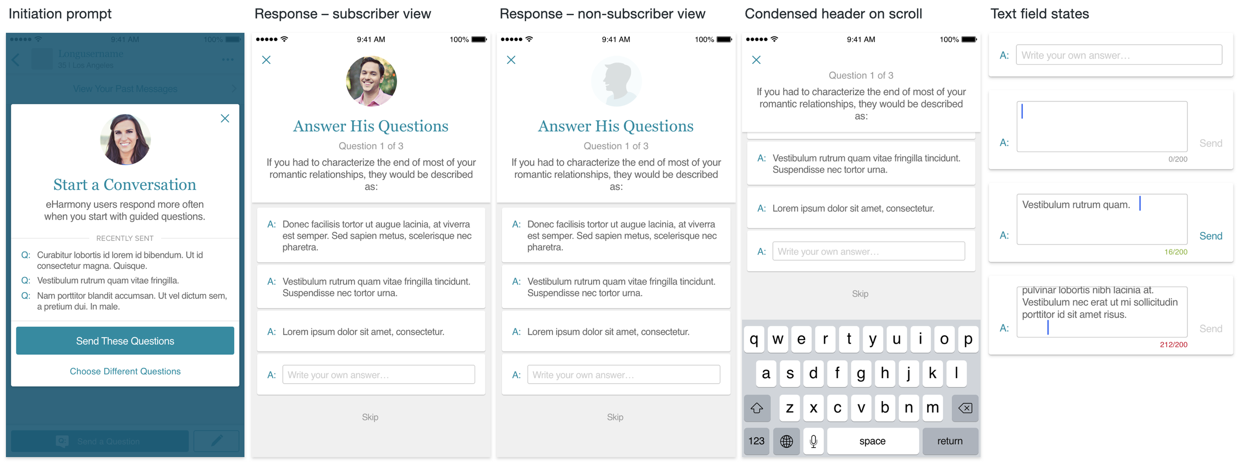
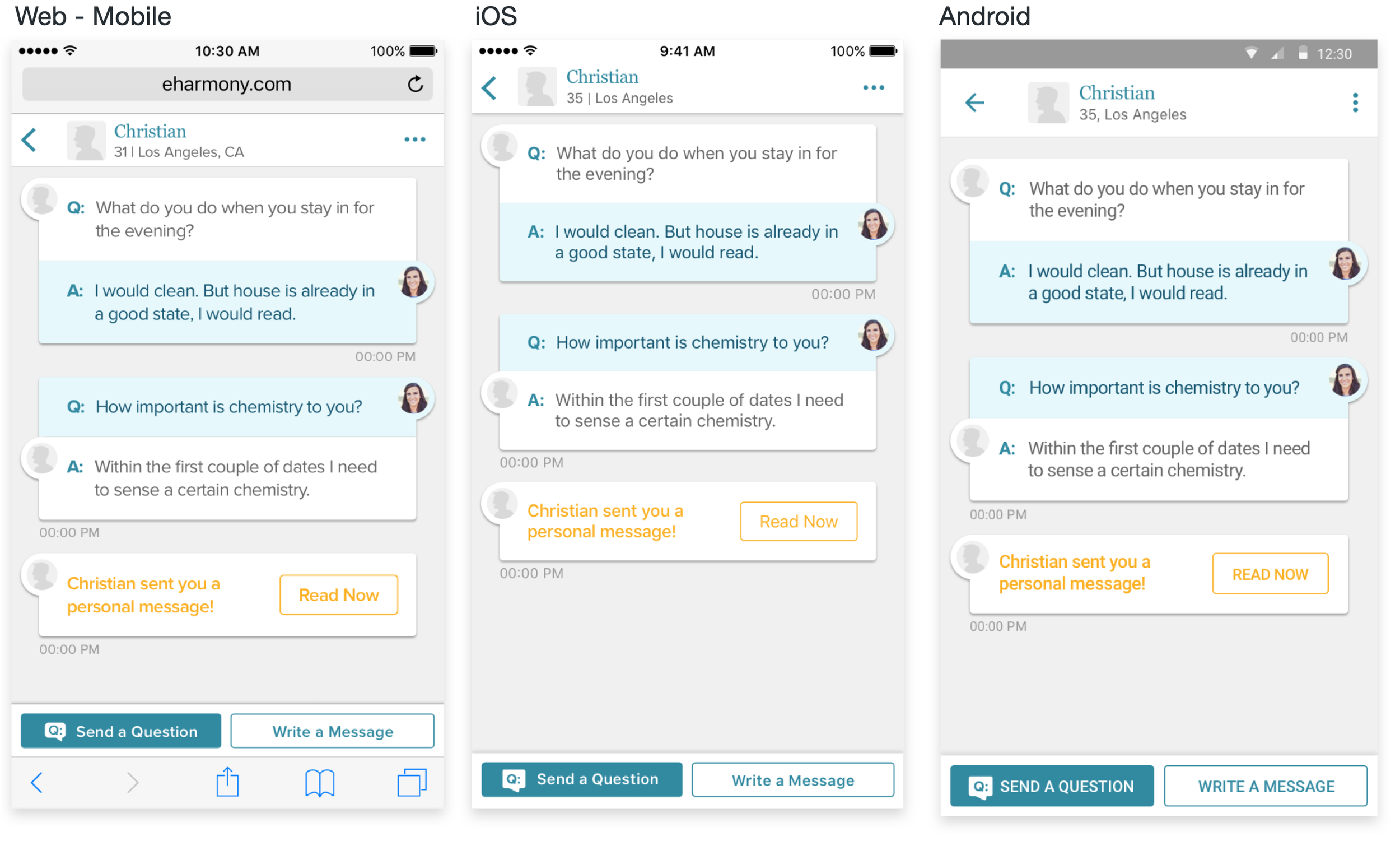
Users told us the original “Quick Questions” were the most valuable. So I retained them while adding more flexibility. Previously you had to answers all questions to proceed. Now you could answer questions individually or skip a question altogether.
This avoided friction in the conversation if there was something you didn’t want to answer or you wanted to take more time to answer it. You could also continue sending guided questions for free as long as you wanted. Or, you could subscribe to write custom messages at any time.
Production Design
A fixed deadline forced me complete specs while tickets where in active sprints. This wasn’t ideal and initially generated a lot of UX bugs. To correct this, I worked with Tech leads to formally include UX reviews as a swim lane in dev sprints as a complement to the technical QA process. This helped the team catch design bugs when there was still time to correct them.

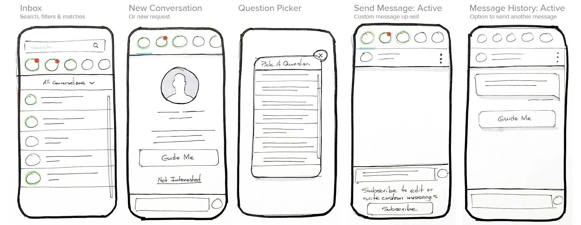
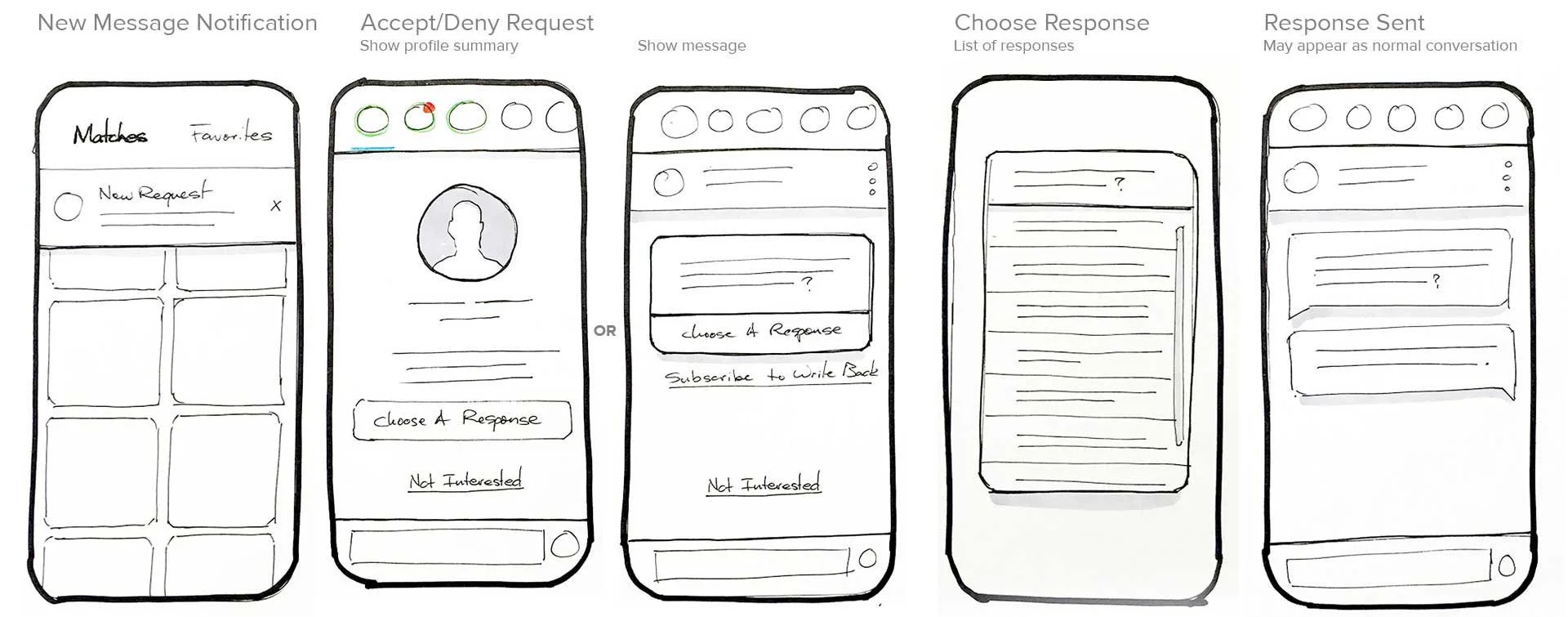
Wire-flow Diagram
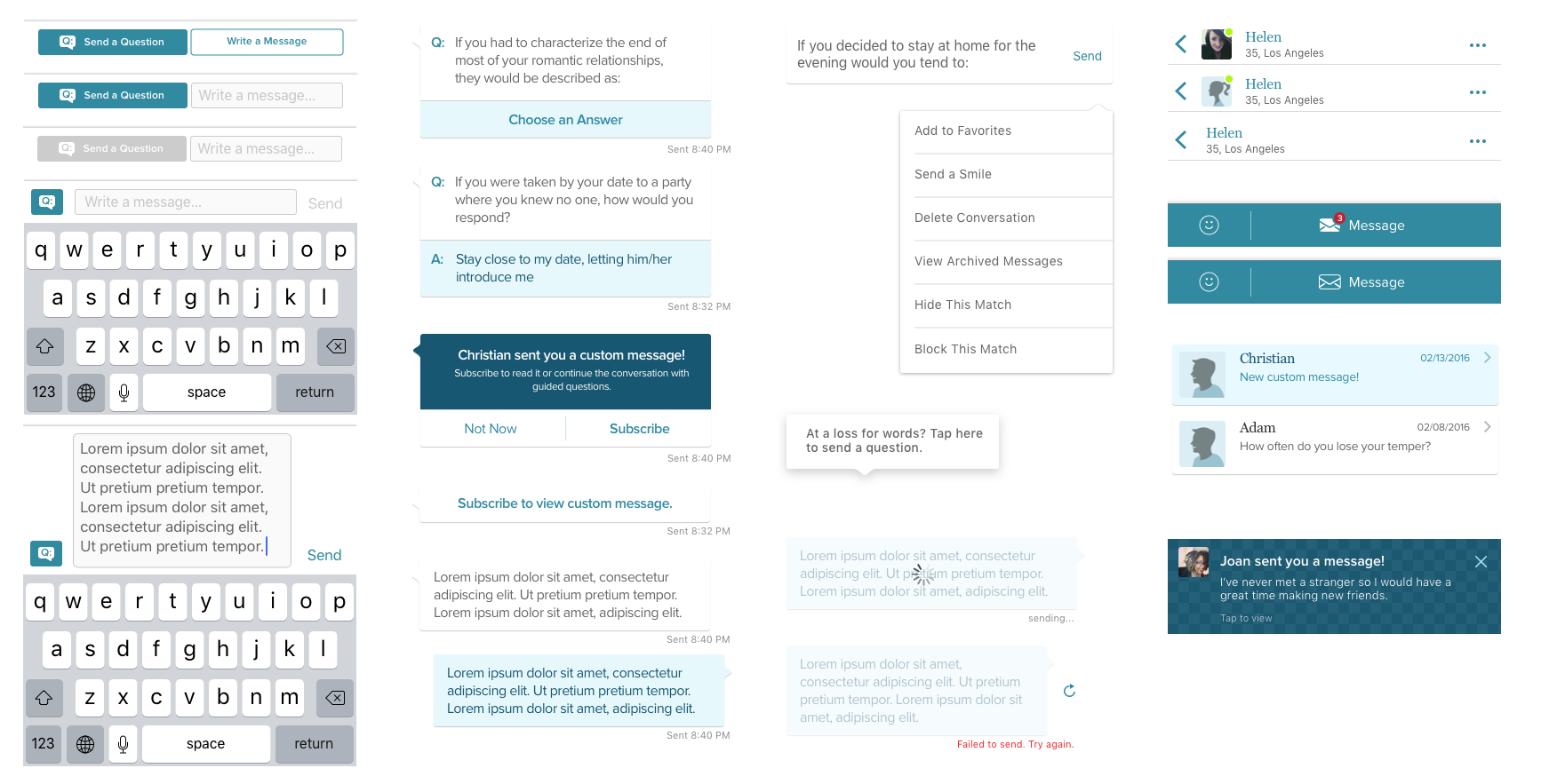
UI Kit
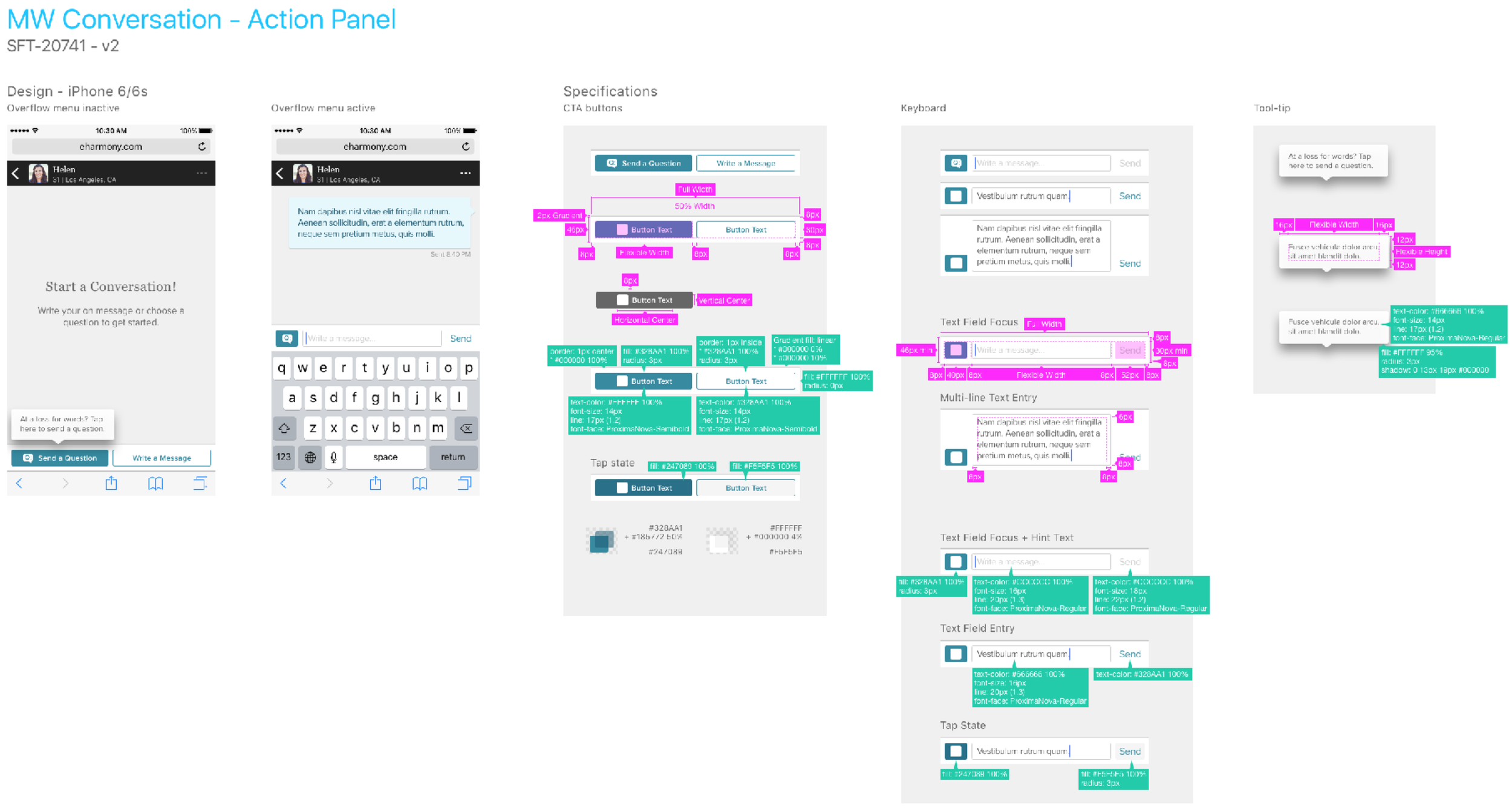
Specs
Cross-platform Design
As the design lead, I laid the foundation for iOS and MW. Then I supported an associate designer with guidance and feedback on the Android and Desktop designs. I took this approach because the Material Design system was well documented providing some helpful guardrails. And the Desktop designs were a close match to the Mobile Web designs I provided.
The challenge was balancing the benefits of platform consistency with product consistency. I kept core behavior, like navigation, consistent with the platform and only customized UI when it was necessary to meet important user and business needs.

Results
+20%
Total Communication Volume
+100%
2-way Communication YoY
+20%
Subscriptions from Comm.
Lessons Learned
What went well?
I was able to use just enough design process to deliver value while keeping stakeholders aligned and engaged. Our team collaborated well to implement a flexible, cross-platform experience. And we launched a solution that proved to be a win-win for both users and the business.
What could be improved?
Documentation of interaction patterns was lacking and often left tech guessing. And as a design lead, I missed opportunities to be a better partner to others to improve their process and skills.
Learnings
This project was foundational to my understanding of SCRUM, and how to integrate UX into tech sprint cycles. It’s a lesson I’ve continued to lean on as an individual contributor and share with others as a manager.